How to Use Color More Effectively in Design
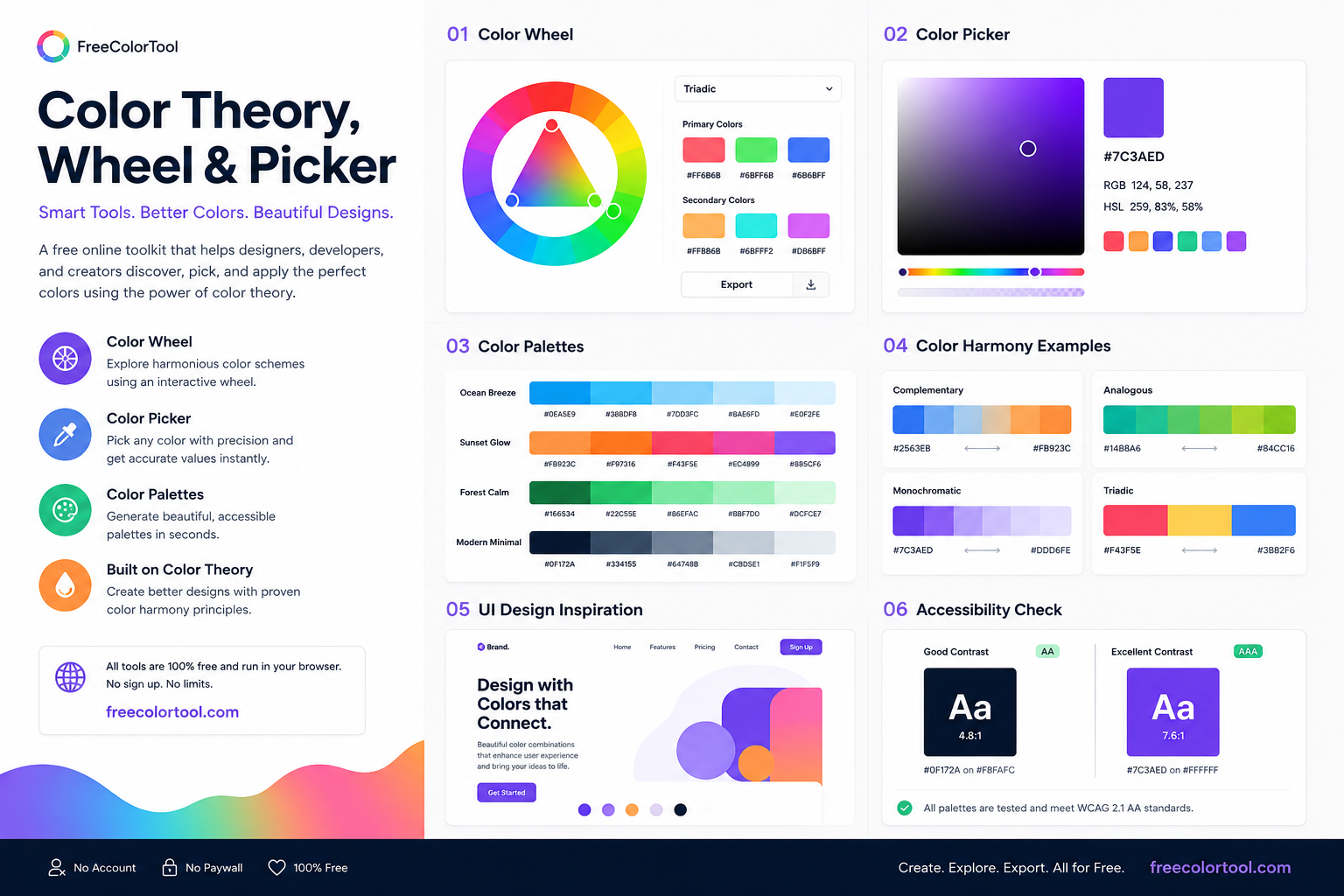
How to Use Color More Effectively in Design
Color is one of the first things people notice when they see a website, graphic, logo, illustration, or digital product. It can influence mood, improve visual hierarchy, highlight important information, and help establish a recognizable identity. A free color tool can make the process much easier by allowing designers and creators to explore palettes, mix colors, pick exact shades, generate gradients, and experiment with different combinations in one convenient place.
Whether you are a professional designer or someone creating a simple project for the first time, understanding how colors work together can significantly improve your results.
Why Color Selection Is Important
A design can have excellent typography, beautiful images, and a well-organized layout, but poor color choices can still make the final result feel unfinished.
Color helps create visual order.
For example, a website can use one color for primary buttons, another for secondary actions, and neutral colors for backgrounds and text. When these choices remain consistent, visitors can understand the interface more quickly.
Color can also create emotion.
Warm colors may feel energetic and inviting, while cool colors can create a calmer appearance. Dark palettes can appear dramatic or sophisticated, while light palettes often feel clean and open.
The important point is that color should support the purpose of the project.
Start With a Clear Design Objective
Before opening a color picker or creating a palette, think about what you are designing.
A business website may need a professional and trustworthy appearance.
A children's project may benefit from bright and playful colors.
A photography portfolio might use mostly neutral colors so the photographs remain the main focus.
A technology application may use a modern combination of dark surfaces and vibrant accents.
There is no universal color palette that works for every situation.
Your objective should guide your choices.
Choosing Your Main Color
A simple way to begin is by selecting one primary color.
This color becomes the foundation for the rest of the palette.
Think about the message you want to communicate.
Blue is often associated with reliability and calmness.
Green can suggest nature, freshness, or growth.
Orange can feel energetic and friendly.
Purple can create a creative or luxurious impression.
Red can attract attention and communicate energy.
These associations are only starting points. The exact shade, saturation, surrounding colors, and design context can completely change the appearance.
Creating a Palette From One Color
You do not need to begin with five or ten different colors.
Start with one.
Then create lighter and darker versions.
For example, if your main color is blue, you might create:
Very light blue for backgrounds
Light blue for secondary surfaces
Medium blue for branding
Dark blue for headings
Deep navy for strong contrast
This creates a connected visual system.
Once these variations are established, you can add an accent color if needed.
Understanding Color Harmony
Color harmony refers to combinations that create a visually pleasing relationship.
The color wheel provides a useful way to understand these relationships.
Several common approaches can help you create palettes.
Complementary Colors
Complementary colors are positioned opposite one another on the traditional color wheel.
They create strong contrast and can be useful when an element needs to stand out.
For example, blue and orange can create a powerful combination.
However, using both colors in equal amounts may be too intense. One can be dominant while the other serves as an accent.
Analogous Colors
Analogous colors are located near each other on the color wheel.
They generally create a smoother and more unified appearance.
Blue, blue-green, and green are an example.
This type of palette can work well for calm interfaces, nature-related designs, and editorial layouts.
Monochromatic Colors
A monochromatic palette uses variations of one basic hue.
Different shades, tints, and tones can provide enough variation for a complete design.
This is particularly useful for minimalist websites and modern interfaces.
Triadic Colors
Triadic palettes use three colors spaced around the color wheel.
They can create a balanced and energetic appearance.
To keep the result controlled, use one color as the dominant shade and the other two as supporting accents.
Understanding Saturation
Saturation describes how intense a color appears.
A highly saturated color looks vivid and strong.
A low-saturation color looks softer and more muted.
Both have their uses.
A bright accent can attract attention, while muted supporting colors can keep the overall design calm.
One common mistake is using highly saturated colors everywhere.
If every element is bright, nothing stands out.
Using one or two strong accents against a quieter palette can be much more effective.
Understanding Lightness
Lightness describes how light or dark a color appears.
Changing lightness can create different versions of the same hue.
A light variation can work as a background.
A medium version can become the primary color.
A dark version can be used for headings or borders.
This allows you to build depth without introducing too many unrelated colors.
Using Color Codes
Digital design requires precise color values.
Instead of describing a color as "dark green," designers can use an exact code.
HEX is one of the most common formats.
For example:
#FFFFFF represents white.
#000000 represents black.
Other formats such as RGB and HSL are also useful.
RGB describes colors through red, green, and blue values, while HSL describes hue, saturation, and lightness.
Knowing these formats can make communication between designers and developers much easier.
Color Picking From Images
Sometimes the best palette already exists in a photograph, illustration, logo, or screenshot.
Instead of trying to recreate those colors manually, you can extract color references from the image.
This can be useful when creating a design based on an existing visual style.
For example, imagine you have a photograph with beautiful sunset colors.
You can identify the dominant shades and use them as the foundation for a website or poster.
The same technique can be used with product photography, artwork, brand references, and interface screenshots.
Building a Palette From a Logo
A logo often contains colors that can become the foundation of an entire brand system.
Once you identify the main logo colors, you can create lighter and darker variations for different applications.
You can also add neutral colors for backgrounds and text.
This approach helps ensure that the website, social media graphics, and marketing materials all feel connected to the brand.
Working With Color Mixing
Color mixing is useful for understanding how different shades interact.
Artists can use digital mixing to experiment before working with physical materials.
Designers can also use mixing to create intermediate shades that may not be available in a basic palette.
For example, instead of choosing a random green, you can experiment with different amounts of blue and yellow until you find the desired result.
Digital experimentation is convenient because you can test many combinations without wasting physical materials.
Designing Better Gradients
Gradients have become a common design element in modern websites and digital graphics.
A gradient can transition between two or more colors and add depth to an otherwise simple composition.
There are several ways to use gradients.
A linear gradient can work well as a website hero background.
A radial gradient can highlight a particular area.
A conic gradient can create more unusual visual effects.
The key is to make the gradient support the content.
If the colors are too intense, text and other elements may become difficult to see.
Color in User Interface Design
User interfaces depend heavily on color.
Buttons, links, alerts, navigation elements, cards, forms, and status indicators often use color to communicate their purpose.
A consistent color system makes these interactions easier to understand.
For example, if the primary action button is blue, users can learn to recognize blue buttons as important actions.
If that same color is used randomly for decorative elements, its meaning becomes less clear.
Designing Accessible Color Combinations
Good color design should also consider accessibility.
Some people have difficulty distinguishing particular colors.
This means important information should not rely exclusively on color.
For example, an error should not be communicated only by making text red. A clear message or icon should also explain what happened.
Contrast is equally important.
Text should remain readable against its background, including on smaller screens.
Accessibility improves the experience for everyone, not just people with specific visual needs.
Creating a Website Color System
A website can benefit from a simple documented color system.
For example:
Primary Color: Main brand color.
Secondary Color: Supporting visual elements.
Accent Color: Important actions and highlights.
Background: Main page or section background.
Text: Primary readable text.
Muted: Secondary text and subtle elements.
Once these roles are defined, designers and developers can use the colors consistently throughout the website.
Color for Branding
Branding depends heavily on consistency.
A company may use its colors on its website, logo, packaging, social media accounts, presentations, and advertising.
If those colors change constantly, the brand becomes less recognizable.
This is why professional teams often document their exact color values.
A brand guide may specify HEX, RGB, CMYK, or other values depending on where the colors will be used.
Color for Social Media Content
Social media platforms are visually crowded.
Strong color choices can help content stand out.
However, being noticeable does not mean using every bright color available.
A better approach is to create a recognizable palette.
For example, a creator might use:
One primary background color
One accent color
One text color
One secondary highlight
Using the same system across different posts creates visual consistency.
Color for Presentations
Presentations can become easier to understand when color is used strategically.
Use color to highlight important numbers, separate categories, and guide attention.
Avoid making every heading, paragraph, and graphic a different color.
A limited palette usually produces a cleaner result.
For example, a presentation could use a dark neutral for body text, a primary brand color for headings, and an accent color for statistics.
Color in Digital Art
Digital artists have almost unlimited access to colors.
That freedom can sometimes make choosing a palette harder.
One solution is to create a limited palette before beginning.
Select a few colors that define the overall mood.
A warm palette can create a sunset atmosphere.
A cool palette can create a nighttime or winter feeling.
A combination of muted and saturated colors can help create depth.
Planning the palette first can prevent the artwork from becoming visually inconsistent.
Recoloring SVG Graphics
SVG files are commonly used for icons, logos, illustrations, and interface graphics.
Changing their colors can sometimes require editing the underlying code or opening them in design software.
A specialized recoloring workflow can simplify this process.
You can change individual colors, experiment with different palette options, and create variations of an existing graphic.
This is especially useful when adapting an icon or logo for a new brand color scheme.
Color Tools for Web Developers
Developers frequently need exact color values when building websites.
A designer may provide a palette, and the developer then needs to translate it into CSS.
For example, colors can be stored as CSS variables:
--primary-color
--secondary-color
--accent-color
--background-color
This makes the color system easier to maintain.
If the brand changes its primary color later, updating the variable can change it throughout the interface.
Creating Tailwind Color Scales
Modern web development often involves utility-based frameworks.
A color scale can provide multiple versions of a color, ranging from very light to very dark.
This makes it easier to assign appropriate shades to backgrounds, borders, text, buttons, and hover states.
Instead of creating every shade manually, a color-generation workflow can help developers build a more organized system.
Testing Colors Before Launch
Never assume a palette works simply because it looks good in a color picker.
Always test it in the actual project.
Put the colors into the website.
Test them on headings.
Try them on buttons.
Check them against images.
Look at them on mobile and desktop screens.
Make sure important information remains readable.
Sometimes a color that appears perfect in isolation behaves differently when surrounded by other colors.
Avoiding Common Mistakes
Several mistakes appear frequently in color-based design.
Using Too Many Colors
More colors do not automatically mean better design.
A smaller palette is often easier to control.
Ignoring Contrast
A beautiful color combination is not useful if text cannot be read.
Using Bright Colors Everywhere
Strong colors are most effective when they have something quieter to contrast against.
Changing Colors Without a Reason
Consistency helps users understand interfaces.
Following Trends Blindly
Popular color trends can provide inspiration, but they should not replace project-specific decisions.
A Simple Workflow for Better Color Decisions
You can simplify your process by following a repeatable workflow.
Step 1: Define the purpose of the project.
Step 2: Choose a primary color.
Step 3: Explore lighter and darker variations.
Step 4: Generate complementary or analogous options.
Step 5: Add neutral colors.
Step 6: Choose an accent color if necessary.
Step 7: Check contrast and readability.
Step 8: Apply the palette to the real design.
Step 9: Make adjustments.
Step 10: Save the final color values for future use.
This approach turns color selection into a structured process while leaving plenty of room for creativity.
Why Experimentation Matters
There is no need to expect your first palette to be perfect.
Good color choices often come from experimentation.
Try several combinations.
Compare a warm palette with a cool palette.
Try a monochromatic version.
Then experiment with a complementary accent.
Seeing these alternatives side by side can reveal which direction works best.
This is one reason digital color tools are useful: experimentation becomes fast and inexpensive.
Creating Your Own Color Library
If you work on design projects regularly, keep a collection of successful palettes.
For each palette, save:
Color names
HEX values
RGB values
HSL values
Intended uses
Example projects
Over time, this becomes a personal reference library.
It can help you start new projects faster and give you ideas when you are unsure which direction to take.
Final Thoughts
Color is not simply a decorative element. It is a powerful design tool that can influence attention, emotion, readability, hierarchy, and brand recognition.
The most effective color choices are usually intentional. They consider the purpose of the project, the audience, the surrounding elements, and the role each color will play.
Modern online color resources make experimentation easier. You can explore color theory, create palettes, mix shades, extract colors from images, generate gradients, inspect precise color values, and experiment with different visual directions.
Whether you are building a website, designing a logo, creating social media graphics, developing an application, working on digital art, or preparing a presentation, a thoughtful color workflow can save time and improve the final result.
Start with one color, explore its variations, test different relationships, and always evaluate the palette in the context of the complete design.
The goal is not to use as many colors as possible. The goal is to use the right colors in the right places.